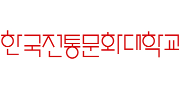
Logo type
Along with the university mark, the logotype is the most basic element that visually conveys the identity of NUCH and is a key element of its UI. The logotype is designed considering its combination with the mark. It cannot be arbitrarily modified and it is designed both in Korean and English.
- < Horizontal logo>
- < Vertical logo>

- < Horizontal logo(eng) >
- < Vertical logo(eng) >
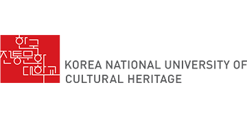
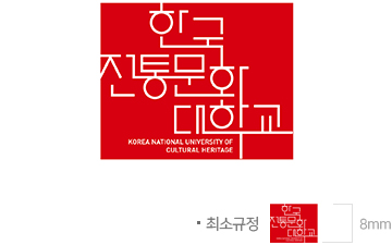
Watermark
NUCH’s UI, presented with the red seal motif, symbolizes the noble identity of the representative traditional culture education institute and the color red represents the passion of students and faculty for education. The construction of the letters that are connected as if written in one stroke represents the organic continuity of traditional culture that connects the past, the present and the future. And the form of letters that opens on four sides symbolizes ‘communication through the education of traditional culture’.
- < Minimum Specification >
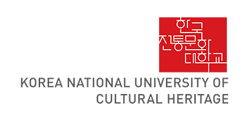
< Watermark(eng)>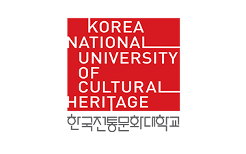
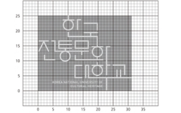
- < Grid>